UX DESIGN
Presstart
Facilitating the online shopping experience.
Facilitating the online shopping experience.
Research
Information Architecture
Wireframing
User Testing
Interaction Design
Visual Design
Brain
Hands
Paper & Pen
Sticky notes
Adobe XD
5 Weeks
Jul - Ago 2019
The goal of this class concept project was to design a responsive full-lifecycle e-commerce of a product of my choice. This website would sell gaming consoles, games, and accessories from brands currently available in the market.
The gaming industry is continuously refreshing the market by releasing products and incorporating new features. Nowadays, due to technological breakthroughs, people face a more complex and overwhelming scenario than used to decades ago while shopping.
A simple online shopping experience for gamers and non-gamers to quickly and easily find and purchase a product that better fits their needs, so they can feel they have made the right decision.


I started by assessing competitor's sites, from successful ecommerces to gaming industry sites. My timeline was tight, so looking at competitors saved me time and allowed me to gather their best user-centered design practices. The research was focused on the following key areas:
The collected data revealed an overlap of features. The majority of the websites were commonly using the same features, content, and language. Here are the key insights from the analysis:
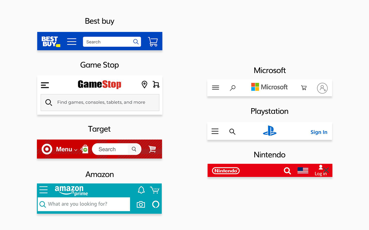
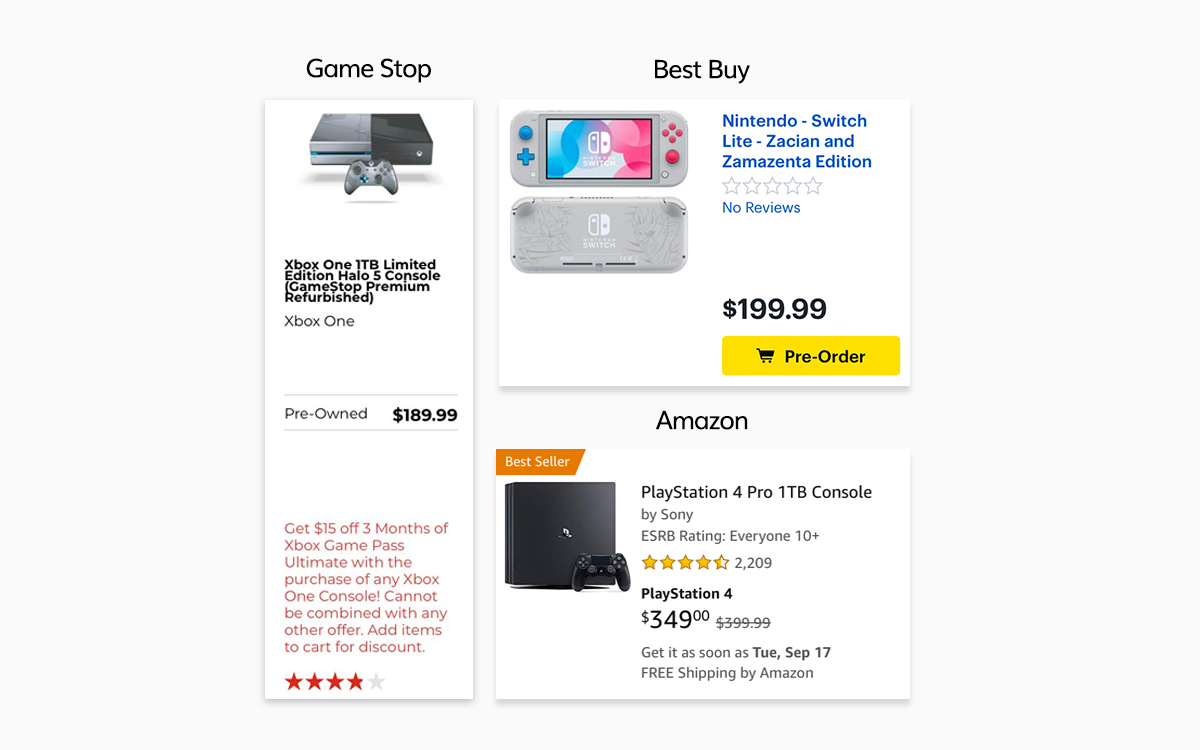
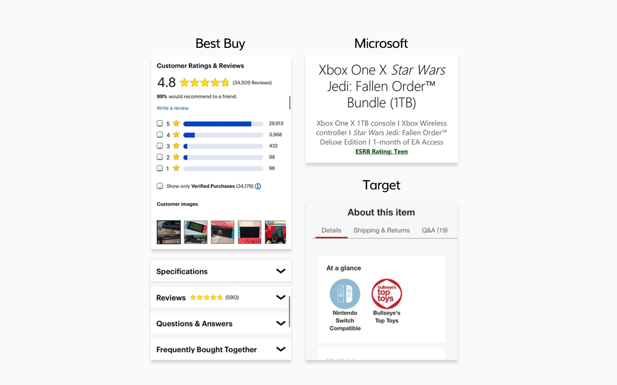
Considering that I was not familiar with the gaming industry, and it has endless categories of products and features, the competitive landscape allowed me to understand and organize the content more rapidly. I set up the main navigation of the website based on this initial research.
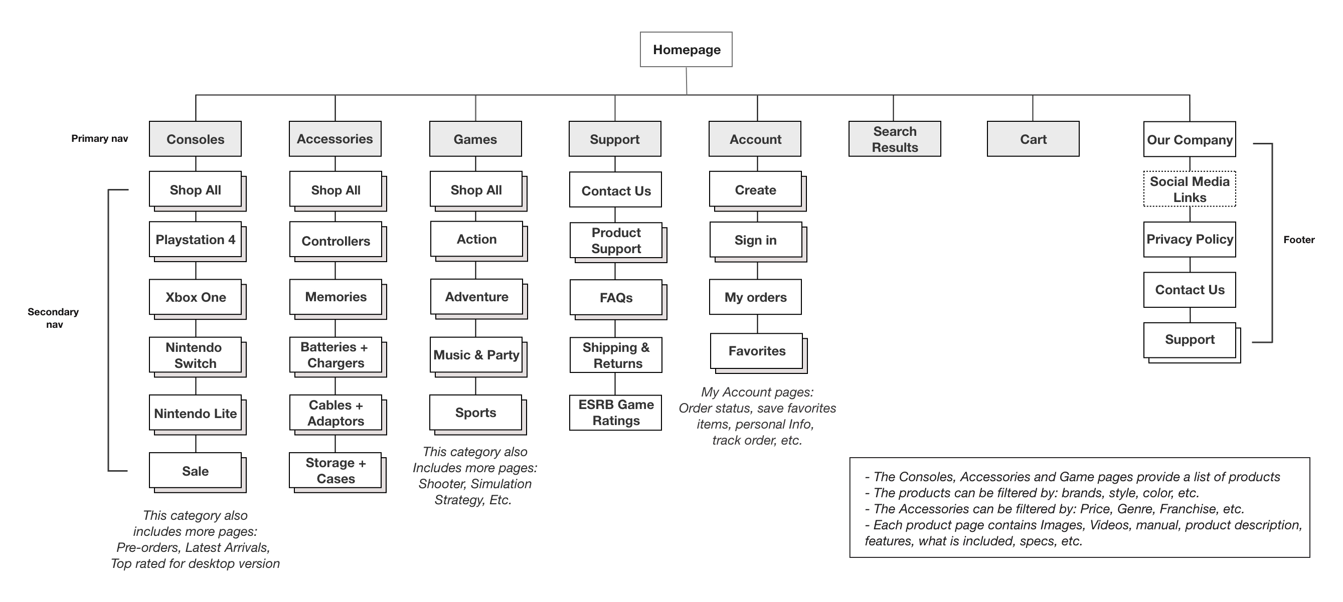
How do users browse and search for a gaming console?
I put into practice my learning from the competitive analysis and tested a paper prototype with two potential users. I wanted to understand their mental models while browsing the website and looking for a specific gaming product. Which tool do they use? Are they getting the information they need? The feedback revealed to me that the current competitor's approach was attending their needs.
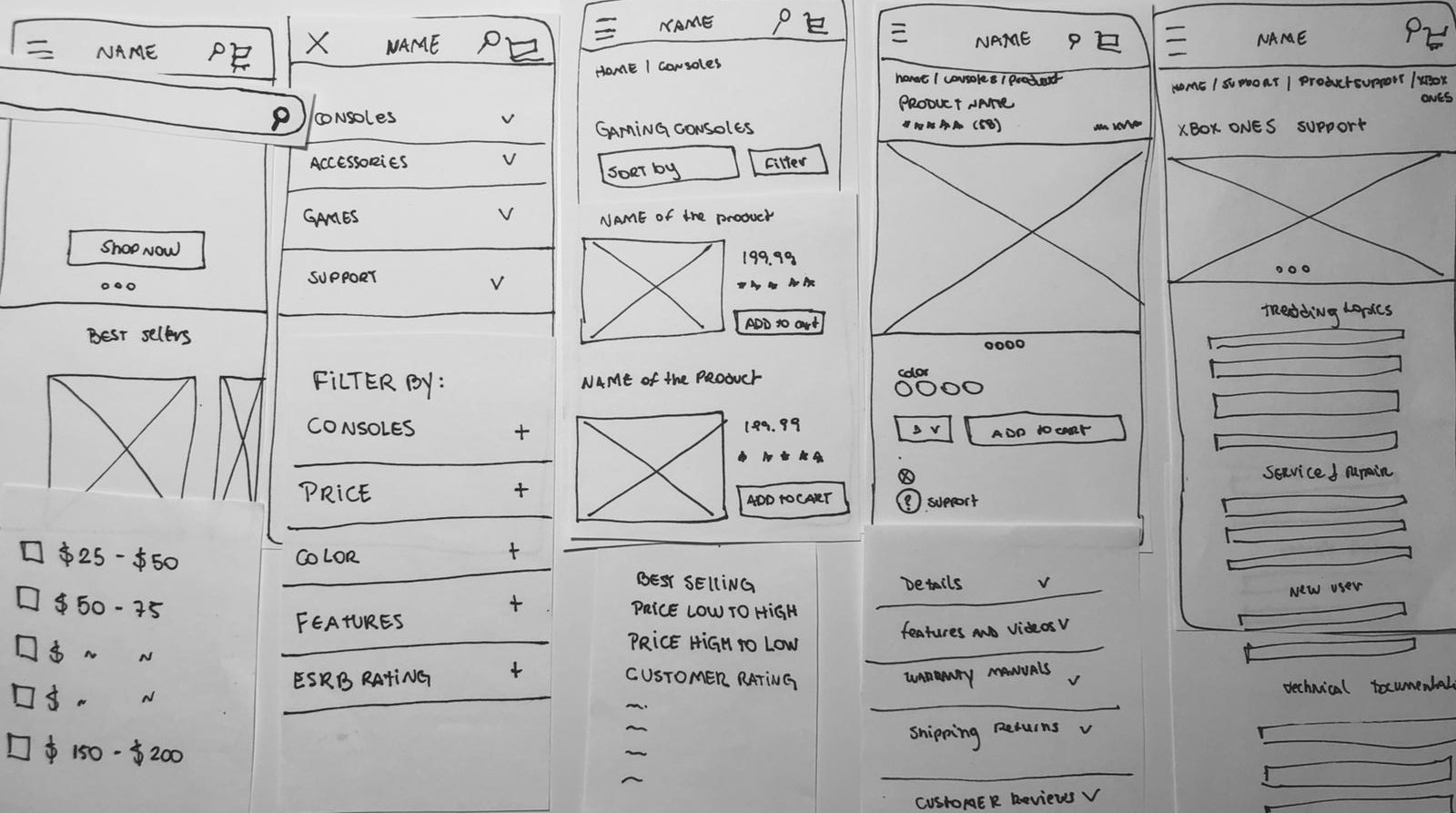

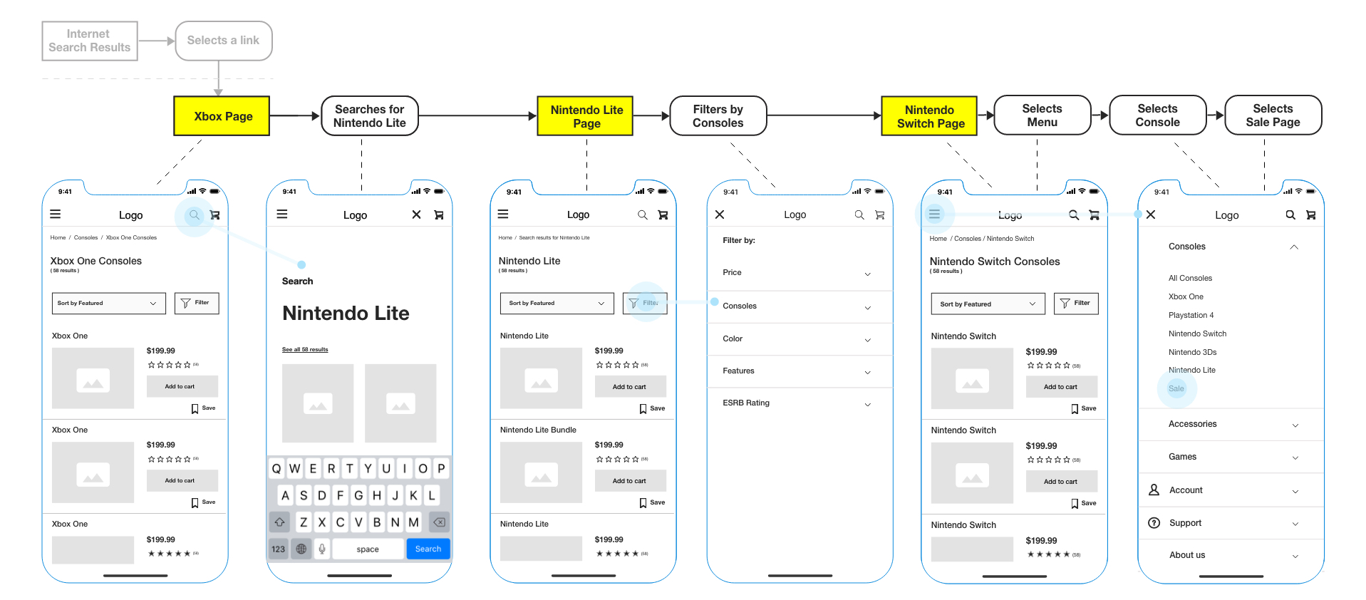
Early on, I discovered that users took different paths while searching for a product. I also learned that the users were able to find the product faster because of the prominent search and filtering tool.
People quickly recognized this prototype as being an ecommerce one because of the highlighted cart button on the main navigation.
I aimed to give the users the best browsing and searching experience so they can navigate smoothly and successfully find the product they want. For that reason:
1. I mainly focused on the active research process a user goes through leading up to purchase.
2. I wanted to ensure that this website would line up with users varying views.
For example:
My next task was to test a medium-fidelity prototype. I conducted a moderated usability test in person with 5 participants. The overall goals of the study were to:
1. Identify issues and further understand users needs while they were using a phone to navigate through the website.
2. Uncover significant problems with labeling, structure, content, and flow.
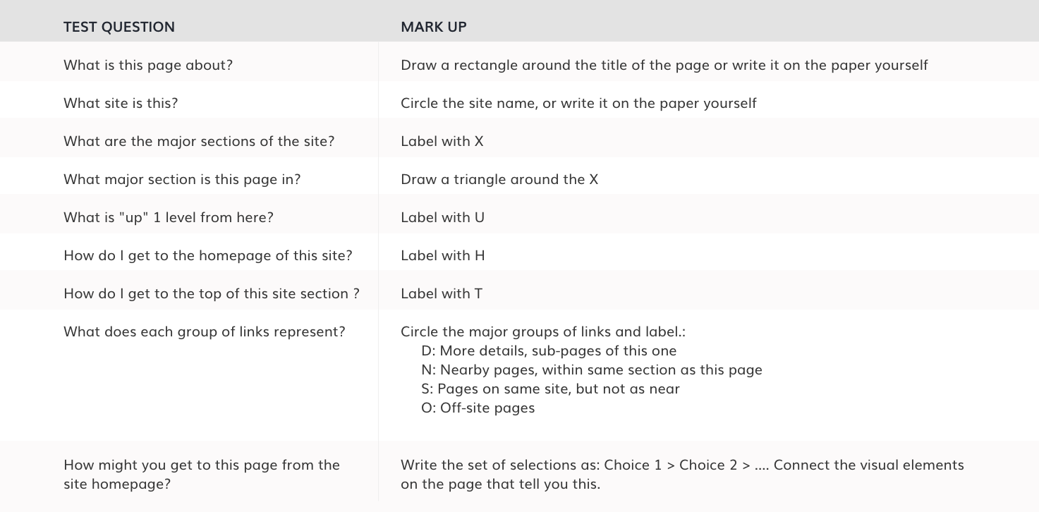
Before testing, I did the Navigation Stress Test to uncover unnecessary navigation issues by answering detailed questions.
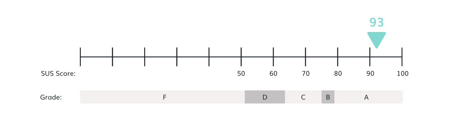
Was this platform usable for users?
I used the System Usability Scale (SUS) to evaluate the usability of the website. The participants ranked each question from 1 to 5 based on how much they agree with the statement. Five means they strongly agree, and one means they strongly disagree.
Below, the SUS questionnaire:
I mapped out issues based on the frequency of occurrence and the actual impact it had on the users' shopping experience. That helped me defining priorities and translating the pain points into needs.
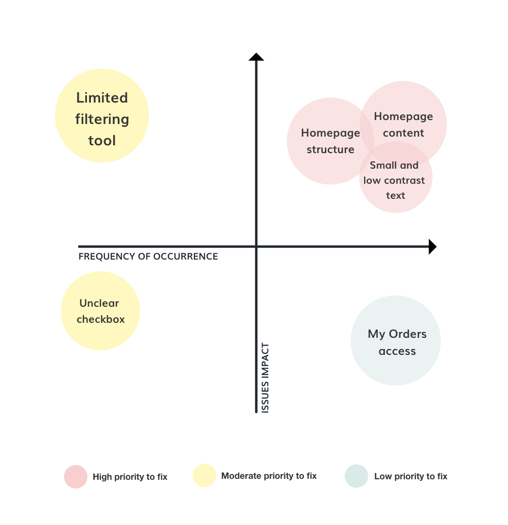
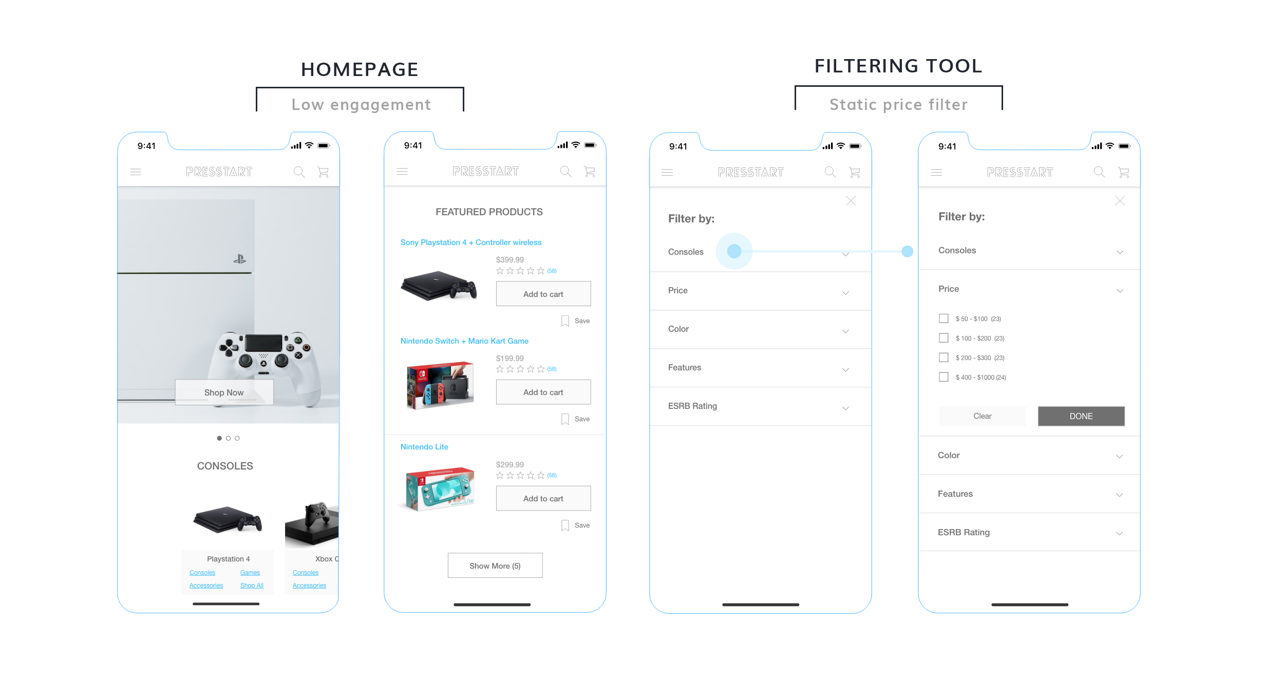
The customers struggled with the homepage content and structure overall because they expected to see bundles, upcoming products, and new releases, which were not being addressed in the current prototype.
The filtering tool was not flexible to customers. Users wanted to set up the price based on their budget, but the current price range pre-defined by a checkbox didn't allow users to filter more precisely.
Some users had a strenuous effort while reading the content. Low contrast colors and the font size was significantly smaller, which diminished the website readability and engagement.
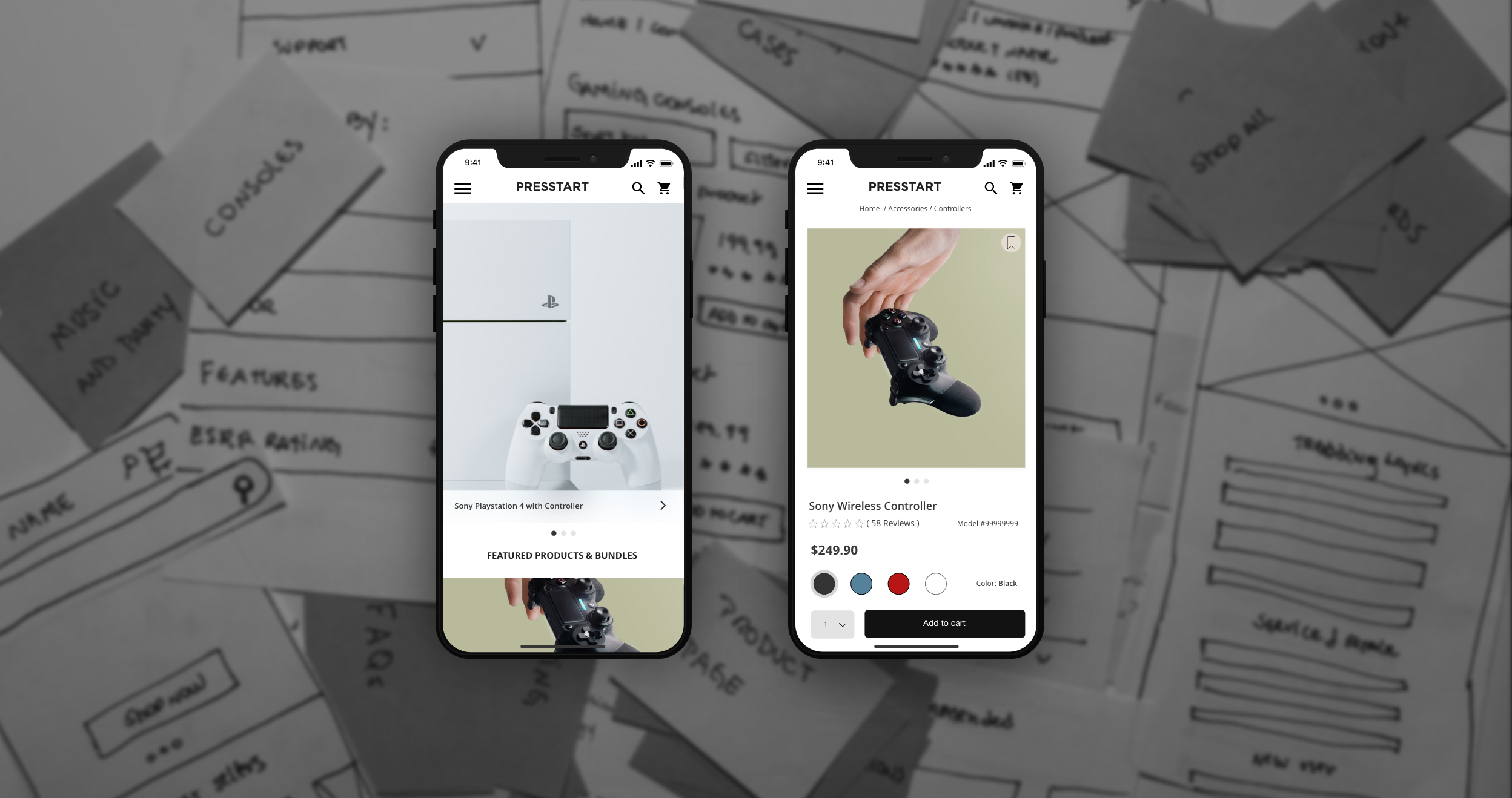
Based on the feedback I got from users I refined the prototype into a high-fidelity. Here are examples of how the prototype has changed throughout the study.
OLD PROTOTYPE - Play with the prototype
NEW PROTOTYPE
Why did I choose to design an ecommerce website for gaming products? Despite not being familiar with the industry and considering me as a non-gamer, I challenged myself to empathize with this scenario and learn as much as I could from users through research. The competitive analysis helped me to draw my design direction, but the conversations and the testing with users were fundamental for my design decisions.
I tested the prototype with young adults throughout the project, but if I had the opportunity, I'd expand the niche and test with younger and older people. Better understanding their needs would help me to design a more accessible website.