UX DESIGN
The Bill and Melinda Gates Foundation Discovery Center
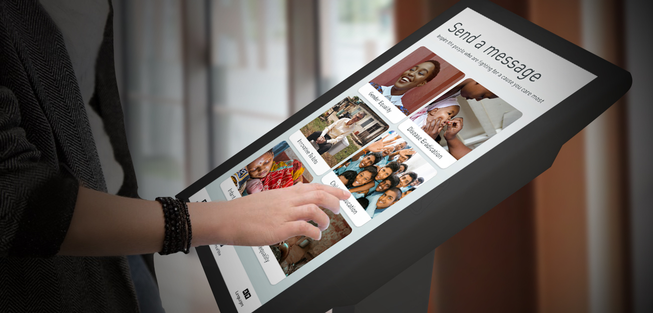
An interactive guestbook for the world's largest philanthropic Foundation
An interactive guestbook for the world's largest philanthropic Foundation
Research
Wireframing
User Testing
Interaction Design
Visual Design
Brain
Hands
Paper & Pen
Sticky notes
Figma
Adobe XD
10 Weeks
Oct - Dez 2019
With his wife Melinda, Bill Gates chairs the largest private foundation in the world, the Bill & Melinda Gates Foundation. They seek to improve the quality of life for millions of people around the globe by solving problems related to education, global health, and poverty. The work is challenging, but they have the optimism and the help of many changemakers to get those problems solved.
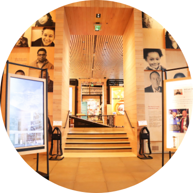
The Bill & Melinda Gates Foundation came to us because they had another problem to be solved. They have a Discovery Center located at the headquarters of the Foundation to exhibit the philanthropic work they do, which attracts about 80,000 visitors a year. However, the Discovery Center had a paper guestbook that made it difficult to collect visitor's information and comments efficiently.
They needed to know who their visitors are and continue the conversation with them after they leave. They also wanted more people interacting with the guestbook.
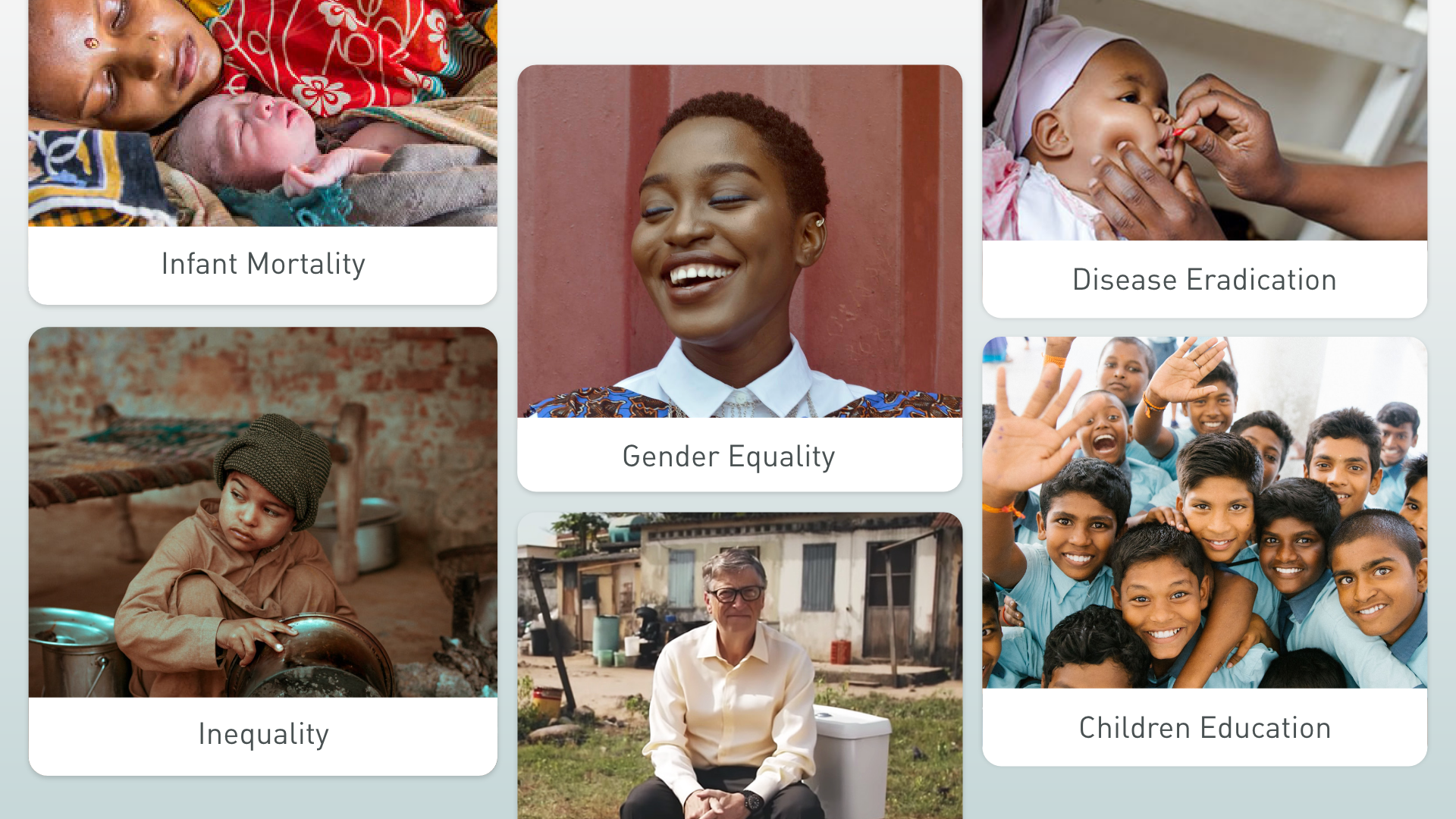
Humans who are showing the vision and work of the Foundation and the changemakers it partners with.
Humans who partner with the Foundation to transform the lives of millions of people every day. For example, UNICEF, Doctors Without Borders and several others organizations, communities and leaders.
Humans who are visiting the Discovery Center to learn more about the work of the Foundation. The majority are youth, young adults and educators.
As part of my Capstone class, I worked on a team of six students. I collaborated with the development of the user flow. In addition, I was responsible for interaction design and prototyping. I also facilitated usability testing sessions.
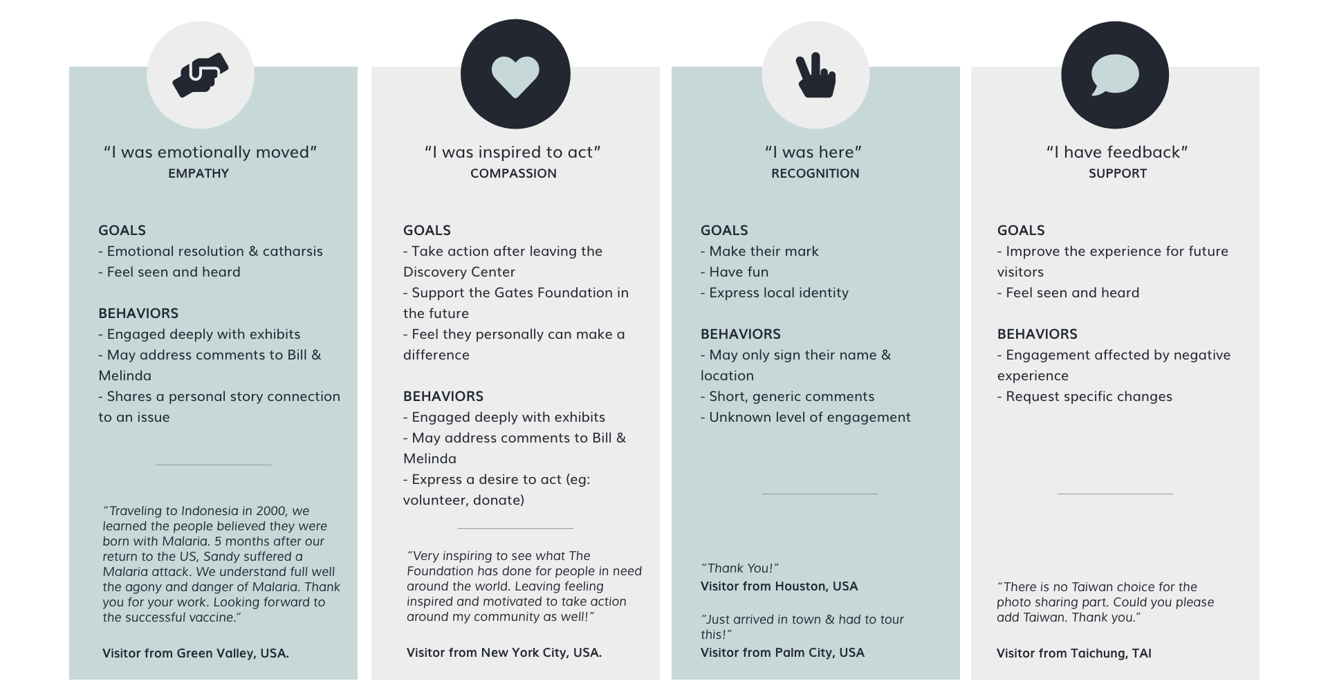
Not surprisingly, after looking at existing guestbook comments and other comments scattered at the Discovery Center, we learned that visitors feel a personal connection with the changemakers and the work they do on causes.

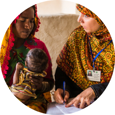
We also interviewed visitors at the Discovery Center in order to learn more about their motivations, goals, needs, and connection with the causes and organizations. We chose 10 young adults randomly and the conversations revealed that both Discovery Center and visitors wanted further connection.
Some of the interview questions:
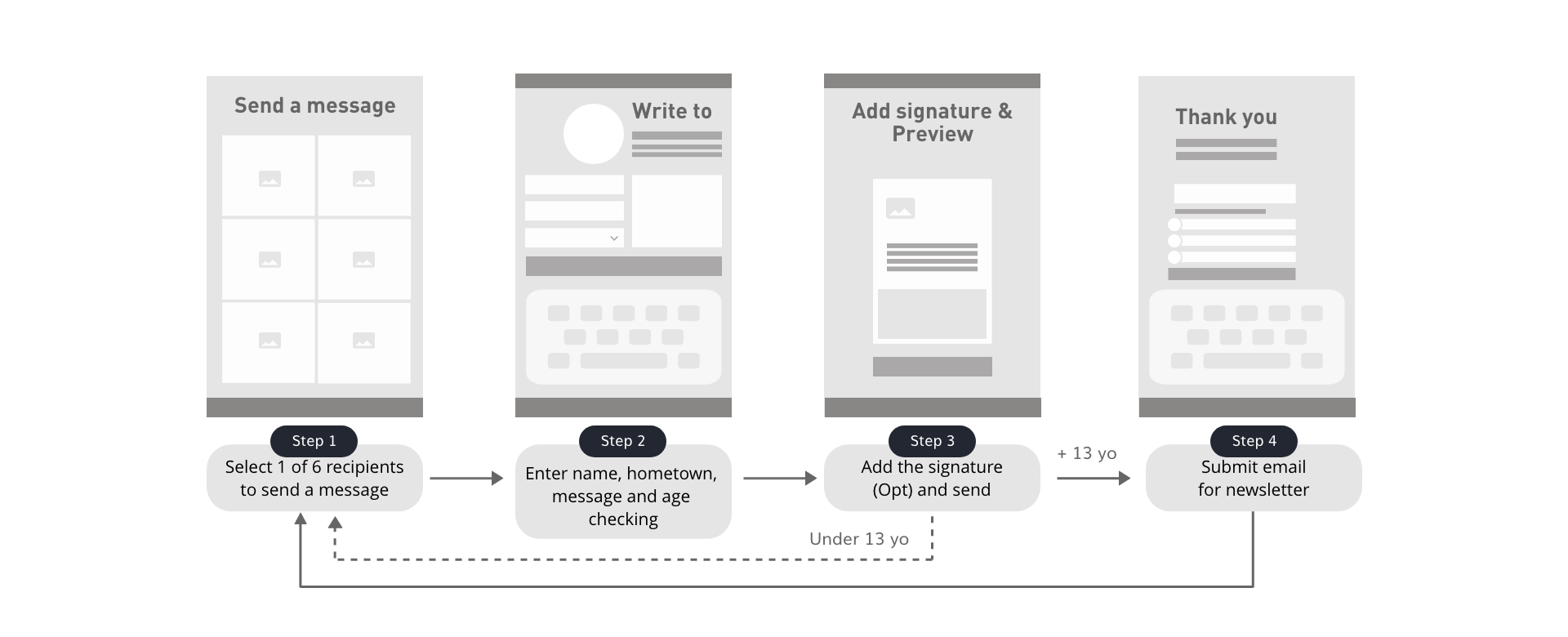
We proposed that Discovery Center not only improves their guestbook experience, but also connects visitors with the changemakers and the causes they care about. Our solution will:
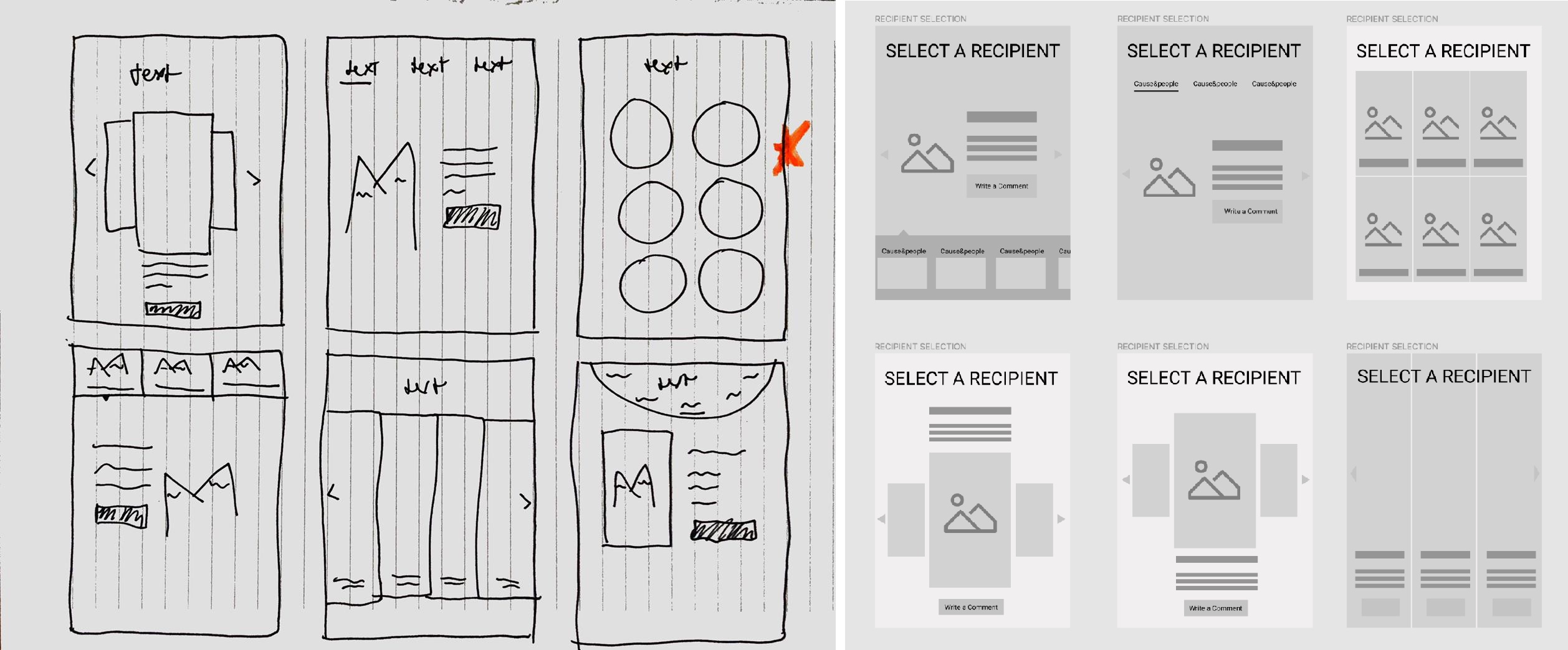
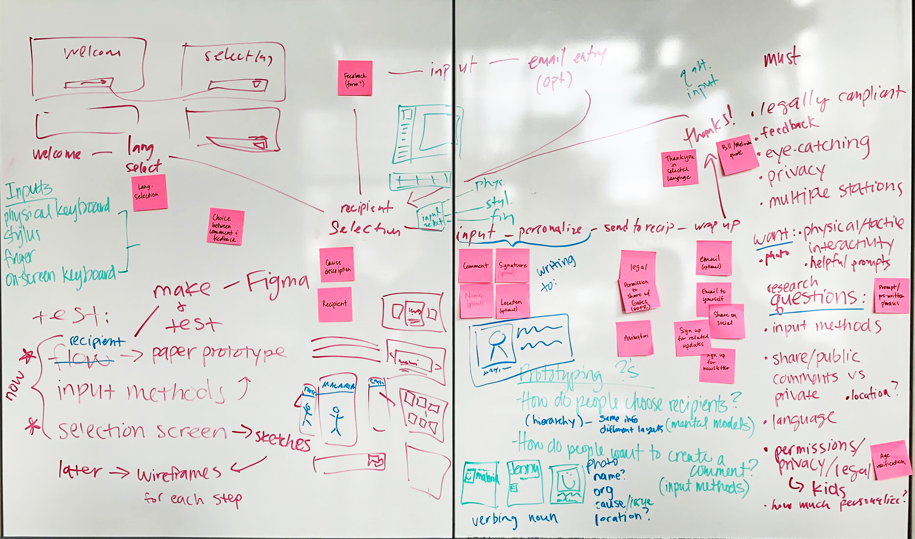
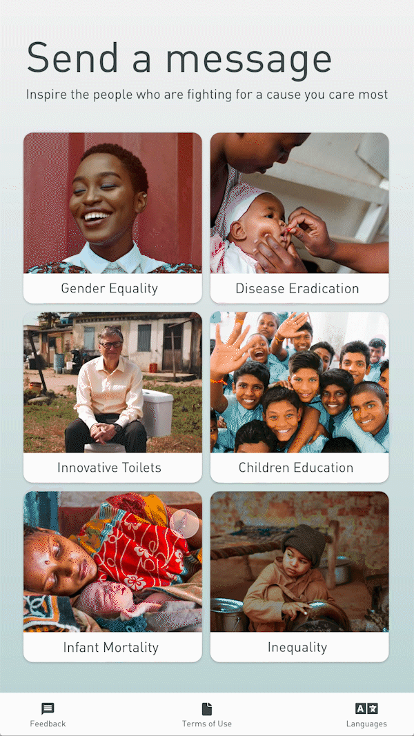
One of my design challenges was to provide a clear and efficient way to display the changemakers. On this selection screen, the visitors would have to choose one of them to start the experience.
While sketching, I approached a photo-centered design to make it more scannable, eyecatching, and to strengthen the personal connection between visitors and changemakers.
I presented my designs to the team, and we decided on the screen that displays six changemakers at a glance. We believed that providing an overview would encourage visitors to make their choices more rapidly.
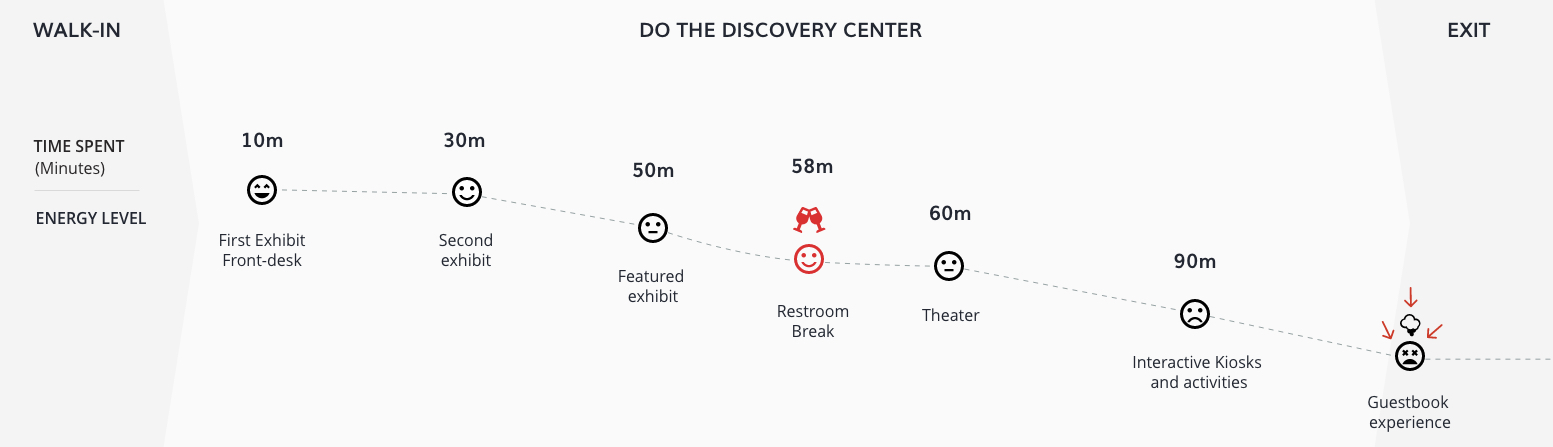
Considering that our guestbook experience would be next to the exit route and visitors get tired and overwhelmed during the visit, we focused on a simple and straightforward user flow.
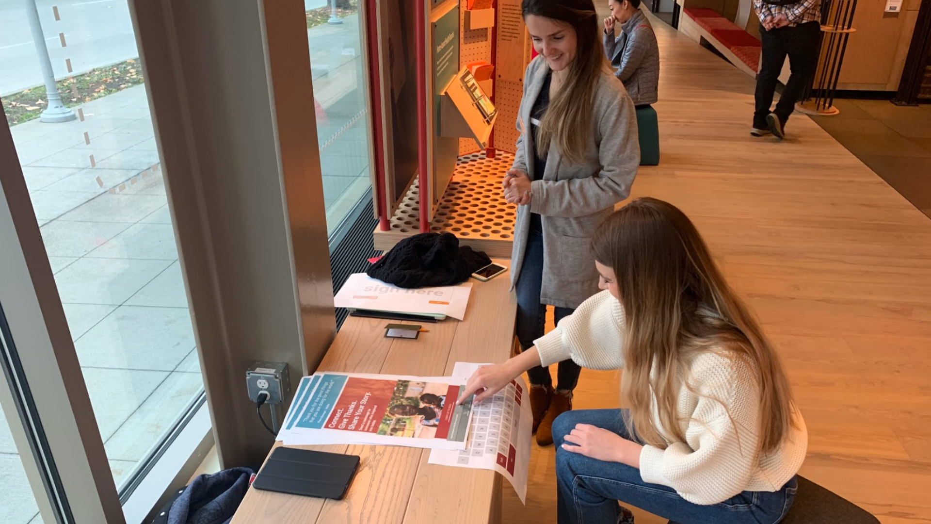
A teammate and I facilitated the first usability test session with six visitors at the Discovery Center. We asked them to think aloud while walking through the paper prototype. Our main questions were:
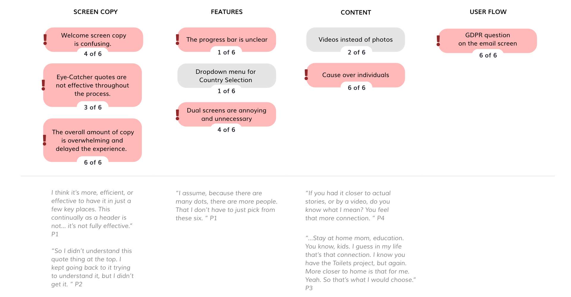
After testing, I organized the insights into the affinity diagram and shared it with the team. I learned that:
1. The visitors felt more emotionally connected with the causes, rather than with a specific changemaker.
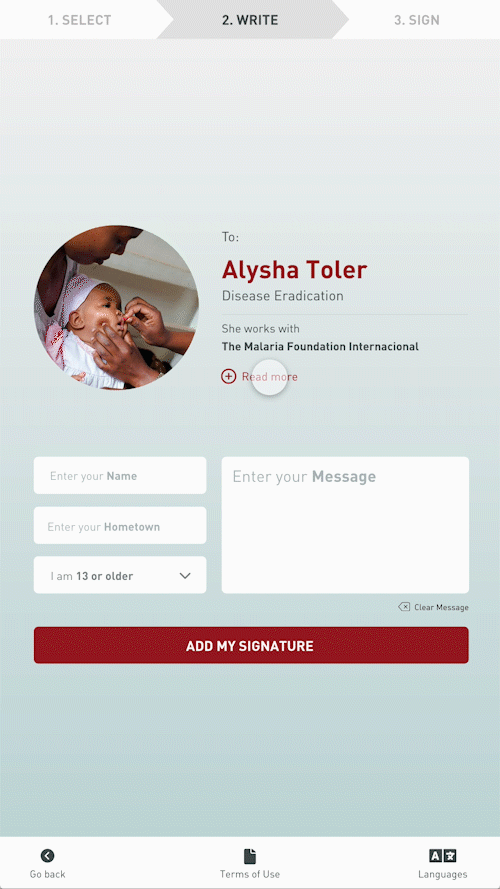
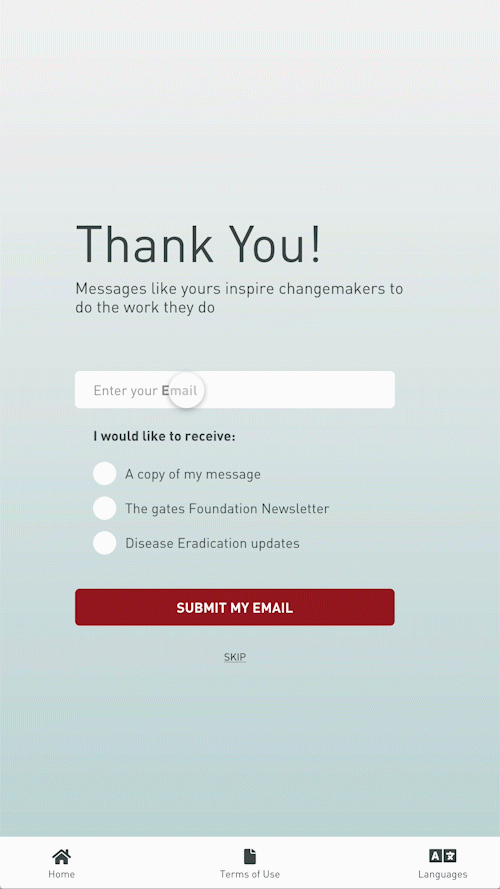
2. Visitors expected an on-screen keyboard to slide up when tapping on the fields to enter information. The dual screens were found to be confusing to visitors and unnecessary work.
3. Although all visitors completed the tasks successfully, the amount of copy on the screens was confusing and overwhelming. As a result, they spent more time than expected to accomplish the experience.
By reducing the amount of copy and clutter
By adapting for one screen
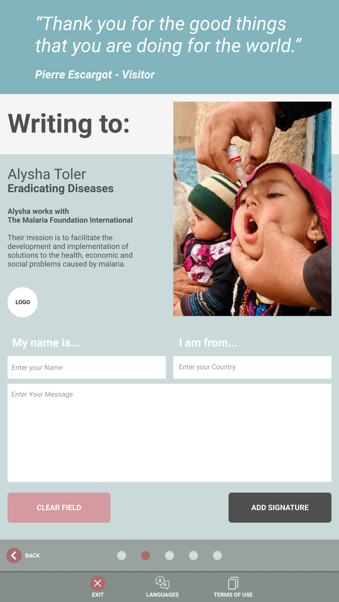
I implemented the on-screen keyboard, and the writing prompts to speed up the experience and make it easy to follow.

By lessening the user flow
I worked with my teammate to reduce the overall time of the experience. We cut down the user flow from eight steps to four steps.

Because of the tight timeline, I quickly moved from low-fidelity to high-fidelity prototype. I was also able to follow the Foundation's aesthetics and branding by choosing a color scheme with high contrast to increase the legibility.
After 10 weeks, we presented this project to the Bill & Melinda Gates Foundation during our capstone presentation at the School of Visual Concepts.
If I had more time, I would love to explore more possibilities to design a mobile experience as well. There are some busy moments at the Discovery Center throughout the day, so this could alleviate the guestbook station and be even more accessible. Through a QR code, visitors would be able to open the same experience directly on their phones.
This project allowed me to learn a new tool and to improve my prototyping and interaction design skills. It was my first time using Figma, and as a fast learner, I was able to grasp the tool quickly and to collaborate with my classmates throughout the process.